Tuesday 31 October 2017

The Head Of The Class

I'm not dressing up this year, but that's no reason why we can't get in the spirit of Halloween.

skull painting acrylic
5x7 Acrylic on Canvas Board

I used Payne's Grey and Titanium White, so the painting looks more "blue and white" rather than "black and white". I mixed about 5 different greys ahead of time, then blocked in the darkest and lightest areas, and went from there. I didn't worry much about blending.

It was a nice change of pace to paint a picture and only have to focus on the values without worrying about getting the colours right too.

Valuable Lessons Learned Today:

  • Real skulls are yellow, not white.
  • Doing a painting using only one colour is a great exercise in getting the values right (darks and lights).
  • Black and white paintings look cool. I'll have to do one from time to time.

Monday 30 October 2017

Which Way To The Beach?

Every so often I have to take off and take some time for myself. Last summer I spent a few days in Southampton sketching lighthouses, taking photos and hanging out at the beach because it was hot and sunny every day. A few of the photos were exceptional, including this one of a sandy path to the beach.

sand trees path fence acrylic painting
5x7 Acrylic on Canvas Board

I worked fairly quickly on this one, and used only Titanium, Ultramarine, Burnt Sienna and Hooker's Green. Underpainting was a light mix of Burnt and Titanium. I love how the path turned out, with the bold shadows. Simple little painting, and I am happy.

Valuable Lesson Learned Today:

  • If you keep trying, you will eventually paint something you really like.


Sunday 29 October 2017

I Never Promised You A Rose Garden

When I was very young, my dad told me that roses were hard to paint. It's just one of those random things that kids remember out of all the other things they hear from their parents. So just as I did when I was young, I went ahead with this trio of roses and hoped for the best.

5x7 Acrylic on Canvas Board

My underpainting was Alizarin Crimson, Ultramarine and a bit of Cad Yellow Medium added to Titanium. My pencil outline of the roses was satisfactory. At least I can draw with reasonable accuracy. But it seems that I got lost painting the flowers. I was all over the place with regard to tones and brush strokes. In the end, at least they can be recognized as roses. I would like to find a good tutorial on painting roses. They are so beautiful and classic.

I haven't mentioned this before, but any feedback or advice is most welcome!!!

Valuable Lessons Learned Today:

  • Roses are more difficult to paint than lemons.
  • Acquiring good drawing skills helps so much. Getting the overall shape accurately drawn provides a good basis for a painting.


Saturday 28 October 2017

You Say Tomato...

...I say it's time to try a still life of a fruit that's not a tutorial. It was time to break out on my own again and apply what I learned over the last couple of weeks. The reference photo was simple and colourful. But it wasn't as easy as I had hoped.

yellow red tomatoes acrylic painting
5x7 Acrylic on Canvas Board

I am pleased that I got the shadows and highlights. I struggled with everything in between. Maybe I made too many shades of red and confused myself.

I'm pretty tired tonight so I'll leave it at that.

Valuable Lesson Learned Today:

  • Never give up. Keep painting even if you feel like crap.

Friday 27 October 2017

Better Latte Than Never

Lucky Day 13. One last tutorial, I promise. The photo of the coffee cup painting caught my eye, so I followed Will Kemp's How to Paint a Simple Still Life using Oil Paints and hoped it would work with acrylic. Not bad, I think.

blue coffee cup acrylic painting
5x7 Acrylic on Canvas Board
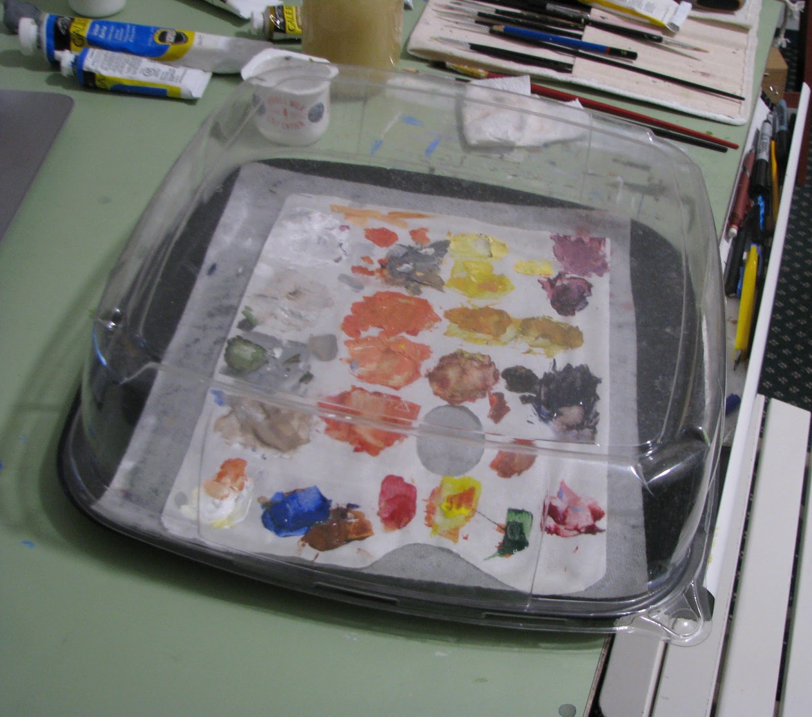
I primed the canvas with  a light grey made from ultramarine, burnt sienna and titanium which was left from yesterday's painting. The dark areas were burnt umber and titanium, and the blue cup was cobalt, cad yellow medium and titanium. I did this one fairly quickly, a little over an hour, but ended up fussing over the fine highlights and shadows near the end. If I can figure our how not to mess things up as I do final touch ups, I'll be showing progress.

I must admit to myself, and all of you, that I'm getting a little tired of having to do a painting each day. The initial enthusiasm has cooled. Kind of like after the first two weeks of school, when the newness wears off, but you're still nowhere near the burnout stage of late in the semester. A little bit dreary, that's all. Posting to this blog is doing the trick so far. It gives me a reason to paint consistently.

Valuable Lessons Learned Today:

  • Priming a few canvases at a time with a neutral ground saves a bit of time. Plus next time you can start painting right away without having to wait for the ground to dry.
  • If you think your painting isn't very good, stand really far back and look at it. The farther back, the better. You will feel a little better anyway.

Thursday 26 October 2017

Nice Jug

Today's painting was another Will Kemp tutorial, just to keep things simple. Only 3 colours were used; burnt umber, ultramarine and titanium white. If I was stuck on a desert island with only three tubes of paint, I would choose those. Not that I would have much time to paint.

brown jug acrylic painting
7x9 Acrylic on Canvas Board
This was a very straightforward subject. I primed the canvas with a very light grey made from the three colours. Then I blocked the darkest areas with a dark grey made with untramarine and a little less of the burnt umber. I'm not crazy about the background, but I was satisfied with the jug.

These two colours make such a great pair because you can make such a range of cool and warm colours. When I did watercolour painting, I used them very often when doing landscapes. I'll have to dig them up and show you...

I spend three times as long mixing colours as I do applying them to the canvas, but I'm getting a bit better at achieving the colours I want. I used more medium this time, and the paint flowed much better.

Valuable Lessons Learned Today:
  • Using more medium in acrylic paint makes it a bit easier to blend.
  • You use a lot of white when painting with acrylic so make sure you have a backup tube. 
  • Cheap tip: You can use one of those plastic bakery birthday cake things to keep your acrylics from drying out. I put a wet paper towel down, then my paint palette sheet on top of it. The paint stayed fine for three days with the lids on tightly. 
Acrylic Paint Keeper

Wednesday 25 October 2017

You Can't Compare Apples to Lemons

I'm pleased with today's painting. I followed another of Will Kemp's tutorials today entitled Light and Shade. I achieved the most realistic piece of fruit that I have ever painted. She's apples, as they say in New Zealand.

green apple painting acrylic
7x9 Acrylic on Canvas Board

I followed the tutorial faithfully. I highly recommend it for those beginning to paint with acrylic. Will Kemp is an excellent teacher who gives clear directions. It is nice to follow someone's directions rather than struggle with wondering what colours to use and how to achieve a painterly effect.I didn't struggle at all, though it took 2 hours because I would watch a segment of video, pause it, then mix and apply paint.

Valuable Lessons Learned Today:

  • If your paint colour says "Hue" after it (Cadmium Yellow Light Hue), it's not as good a quality. You might need more of the paint, and it might not cover as well. If you can afford it, don't buy Hues.
  • Wear painting clothes. Acrylic, unlike watercolour, does not wash out. It kind of looks cool if you start with a white t-shirt and get lots of colours on it though.

Tuesday 24 October 2017

Cherry Jubilee

Feeling discouraged because my last few paintings were disappointments, I decided to get back to basics with some simple tutorials with straightforward subjects. This is Will Kemp's Beginners Acrylic Still Life Painting Techniques Youtube tutorial of a single cherry. Just what I needed to get back on track. It worked! I feel better already. Sometimes a little success goes a long way.

cherry acrylic painting
5x7 Acrylic on Canvas Board
I followed the tutorial pretty much exactly, so if you're curious about what paints and techniques I used, or want to try this little gem for yourself, check out the tutorial link above. I think I was getting ahead of myself and tackling subject matter that I wasn't ready for. So for the next while I will paint simple subjects, preferably single objects.

Valuable Lessons Learned Today:

  • If you get discouraged with your work, try something simple that you are sure to succeed at. 
  • Red plus orange with a touch of white makes somewhat lighter red.

Have Your Cake

I took some beautiful photos of the baked goods at the Mariposa Market this afternoon, then headed home in the rain to paint. Unfortunately I wasn't able to get to the actual painting until late at night. I kind of wish I had bought the cake, because I'd really like some of it's strawberry chocolateyness right now. It would make me feel better.

strawberry cake acrylic painting
5x7 Acrylic on Canvas Board


My end result is not horrible, but I had high hopes for this painting. I thought a change of colour scheme and subject matter would be nice. But I made mud pie of the background which originally had reflections behind the cakes. I ended up painting the grey over them. Reflections aren't as easy as I thought. I still haven't figured out how to blend acrylic paint nicely. I will look for some blending tutorials online.

The pink was Alizarin Crimson, Titanium, and a touch of Cad Yellow Medium to tone down the bubblegum pink. The background is Ultramarine, Burnt Sienna and a touch of Titanium.

One other thing I must work on is getting the paint to flow better. It seems to always be too dry and rubbery. Not enough medium and/or water perhaps.

Valuable Lessons Learned Today:

  • Overblending colours on the canvas can make mud. You can't unblend colours.
  • Don't spend too much time obsessing over one aspect of a painting, such as the background or the frosting on a cake. It can be very discouraging.
  • Step back and make sure your tones (darks and lights) are right. This can make or break a painting.
  • Bring home a cake so you have comfort food after you are done.


Sunday 22 October 2017

Daffy

I realized tonight that one of the most difficult things about posting a picture every day is that sometimes one paints something that one is not proud to show everybody. But the show must go on, and this is a learning experience, right?

5x7 Acrylic on Canvas Board

The reference photo had sunlit daffodils and a bright blue sky with tree branches in the distance. By the time I mixed something close to the yellow in the flowers and applied it over the previous layers of muddy wrong yellow, I saw that the sky was nothing like what I intended it to be. After all, the photo was taken on a bright sunny day. This sky is too dark and gloomy. I understand the theory behind colour mixing, in practice it is much more difficult. I have a lot of colour practice ahead of me, plus my tones were way off. I think part of the problem was that I didn't step back to look at the picture as a whole, I was too focused on the details.

Valuable Lessons Learned Today:

  • Back away from your work every so often and look at it from a few feet away. 
  • Backlit objects are harder to paint than those lit from the front or side.
  • It's only a cheap piece of canvas and an ounce of paint. You'll be better next time and congratulations, you learned something.


Saturday 21 October 2017

Little Lagoon House

I am so tired tonight. Lots of fall yard work. It was all I could do to stay awake long enough to paint this house that I photographed a couple of years ago in Lagoon City on Lake Simcoe. It was one of those perfect summer sunset evenings and luckily I took my camera with me on my evening stroll. In this case, I like the photo much better than tonight's painting, but at least I painted something.

house sunset acrylic painting
5x7 Acrylic on Canvas Board

Let's see if I remember the colours... Burnt Umber, Yellow Ochre, Ultramarine, Titanium, Cad Yellow Light?, and Hooker's Green (cause it's cheap and easy). By the time I got to the shadows on the road I was done for the evening. I will definitely revisit this photo for a redo someday. (PS I just realized I forgot to paint the bushes to the right of the house. Off to bed for me.)

Valuable Lesson's Learned Today:
  • Painting while tired leads to shortcuts and rushed work, which leads to disappointment. 
  • A pair of pliers is very handy for opening acrylic paint tubes. They stick tight even if you don't overtighten them.

Friday 20 October 2017

Oooh Garlic

My Mom hated garlic, so I didn't even know what it tasted like until my teens. It was like a flavour revolution when I finally did. Now I add it to just about every dish I cook.

garlic cloves acrylic painting
5x7 Acrylic on Canvas Board

I primed the canvas with a grey made from Ultramarine, Burnt Sienna and Titanium White. The background is Burnt Umber, and everything else (but the little bits of green on the garlic cloves) is done in different combinations of the priming colours. I added a fair amount of Gloss Medium to the paint this time, just to see what happens and because it was there. The paint blended a little better, it didn't dry on the palette as fast and the paint went further. It did make the picture somewhat shiny, as you can see in the upper left. I think I will get some less shiny medium and see what happens.

Valuable Lessons Learned Today:

  • Using medium extends the paint and keeps it from drying so fast. That and a little bit of water.
  • Don't overwork. The garlic heads have about 4 layers of colours. I finally told myself to stop it right this instant.
  • Don't ever run out of garlic. I did yesterday.

PS I stumbled on a site with the most wonderful daily paintings called Postcards from Provence by British artist Julian Merrow-Smith from his home in France. His still life paintings with lemons are divine.

Thursday 19 October 2017

Jar of Dreams

Day 5. A quaint still life. I thought the jar would be the big challenge, but it seems that the lemon has won again. Maybe I was tired of painting by the time I got to it but I'm in need of more lemon tutorials.

mason jar lemon still life acrylic painting
5x7 Acrylic on Canvas Board

I made the greenish blue of the glass from Cobalt Blue and a bit of Cadmium Yellow Light. It took several tries with different combinations of Aquamarine, Cerulean and Cad Yellow Medium. I could not for the world of me tell of the jar in the photo was a warm or cool colour. I have trouble differentiating some blues and greens. So I experimented until I got something that looked to me like the reference photo.

The lemon. My nemesis. I want to make more than lemonade. I will keep trying. Any advice is appreciated.

Valuable Lessons Learned Today:
  • When painting glass objects, paint the background, then draw the object. Don't draw the object, paint the background over it, then redraw the object. 
  • Include enough of the background colour in your glass objects to show that they are transparent. I had to add more at the end and it really helped.
  • Lemons are hard. At least for me. Oh right, I said that three days ago.

Wednesday 18 October 2017

Halifax Blues

I love Halifax. Especially the houses, shingled and painted in cheerful colours, unlike our neutral places here in Ontario. The city has a personality quite unlike anything I've ever experienced before. It's worth a visit. I took tons of photos last time I visited. I took the reference photo for this painting on a sunny morning walk to get coffee.

Halifax blue house acrylic painting Nova Scotia
Acrylic on 7x9 canvas board
I usually prime my canvas with a neutral ground, yellow ochre for landscapes, or burnt umber and white to make a light grayish brown. But today I tried burnt sienna, thinking that blue on top of reddish might work. This created a challenge I would never have imagined. Yellow does not work well on top of red. It is somewhat transparent. I ended up painting the yellow areas white, then yellow.

I painted pretty quickly tonight because I didn't get started until 10 pm. It took me until after midnight which accounts for this post being dated the 19th. But we did enjoy a great dinner of grilled italian sausages and potatoes. It was all I could do not to go to sleep right afterward.

Valuable Lessons Learned Today:

  • Cadmium Yellow Light is very transparent. It becomes less transparent when titanium white is added to it.
  • Payne's Grey is actually a very dark blue. I added white to it to make shadows. They were very blue. Adding a bit of Burnt Sienna made it more neutral and grayer.
  • Try to paint before dinner time.


Tuesday 17 October 2017

A Good Red Is Hard To Make

After a long day of cutting down trees with the help of my good neighbour, I had very little time to paint. I picked out what I thought would be a simple painting of an old house and gave myself an hour or so to finish it. Two hours later and here it is. Not quite the colours in the reference photo but I ran out of patience and time. I really rushed! I'm not yet ready for speed painting.


abandoned farmhouse painting acrylic landscape
Painted on 5x7 Canvas Board

palette acrylic mess
A mess of reds

I lost track of the paint colours I used, so instead here is one of my palettes. I really struggled to match the warm red of the roof. In the end I used a mix of cadmium red medium and cadmium yellow light, with a bit of titanium white. The sides of the house were a warmer brown than in my painting. I'm still using only the paints that I had in the house. When I get more experience at mixing colours I'll try some different ones. I would like to do this painting again at a later date. PS Follow my blog with Bloglovin

Valuable Lessons Learned Today:

  • Adding white to red does not make light red. It makes pink.
  • There are so many shades of red. I need more experience mixing colours. Lots of paint gets wasted and it takes a lot of time.
  • Don't paint while you are very hungry. It really messes with your concentration.


Monday 16 October 2017

Life Gives You Lemons

I have never painted a still life before. A simple piece of fruit seemed like a good start. The reference photo is from Will Kemp Art School. His tutorials are amazing. I have been watching them in the evenings for some time. He teaches colour mixing and acrylic techniques in a beginner friendly manner.

lemon painting acrylic

I used an 8x8 canvas board and the colours included Titanium White, Burnt Umber, Cadmium Yellow Medium and Cadmium Red Medium. I watched Will Kemp's tutorial last night but did not follow it when I painted, instead opting to just paint freely. It seems that I have a way to go before free works for me.

Valuable lessons learned today:

  • It takes a lot more yellow than red to make orange. Add the red to the orange in very small amounts.
  • Acrylic paint seems to dry more quickly on the palette than on the painting. Do not rest your hand on the painting until it is dry.
  • Lemons are harder for me than I thought. They're not bright yellow, but they are not as orange as this painting either.

Sunday 15 October 2017

The Laziest Painter in the World

Procrastination is my middle name. I've been a painter on and off (mostly off) for over twenty years. It seems the more time I have for painting, the less I am motivated to paint. A small stack of watercolours from the 90's sits in a bag in a box. Some halfhearted oils are kicking around somewhere. I just turned 50.

I happened upon the book Daily Painting by Carol Marine at the local library a couple of weeks ago. Her blog is called Carol Marine's Painting a Day. The idea of the book is to paint daily, in small manageable doses. Small paintings the take an hour or so. I spend more time on Netflix every day.

I have always believed that it is never too late to start (learn, do, play etc.) something. Lassitude is my Confirmation name, so I will try and stick to it even on bad days.

We have a supply of acrylic paints in the house and since I've always like the look of the finished works done by others, I thought I'd start there. I watched many tutorials online and jumped into it today. The reference photo was taken a few years ago at Peggy's Cove in Nova Scotia. I see I have a long way to go.

Acrylic 7x9 on Canvas Board